A couple weeks back, I got a new Toyota 4Runner.
It's amazing and I love it.
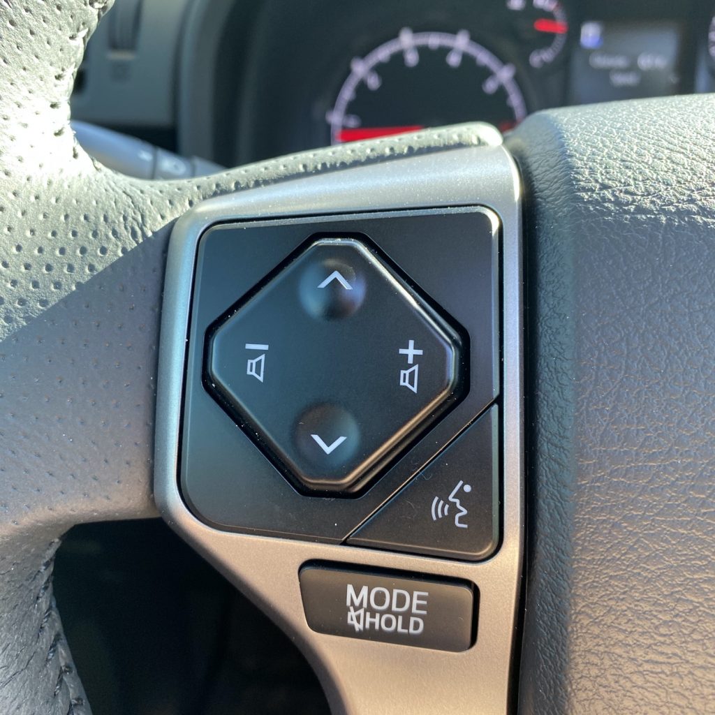
Below is a photo of the audio control panel on the steering wheel.
I do not love it.

Take a close look at the direction of the arrows here. Things like this make me crazy. I’m sure someone somewhere had good reasons for laying things out this way, but whoa does this break my mental model for UI to an audio player.
Volume is almost always represented as moving up and down, which makes you think those controls would be on the top and bottom of the audio control.
Aside from that, progress through an album or playlist is usually represented as a left-to-right progression. If that’s unclear, imagine iTunes’ Cover Flow.
“But wait!” you might say. “Playlists are organized vertically all the time!”. And I would say you’re right – they are. But the “up” button in this case doesn’t go back in the playlist – it goes forward. So hitting the “up” button actually progresses downward through a vertically-oriented playlist.
I trust that you, dear reader, are now also scratching your head along with me. Be right back, I’m going to go search for ways to hack these controls.
